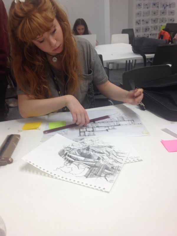
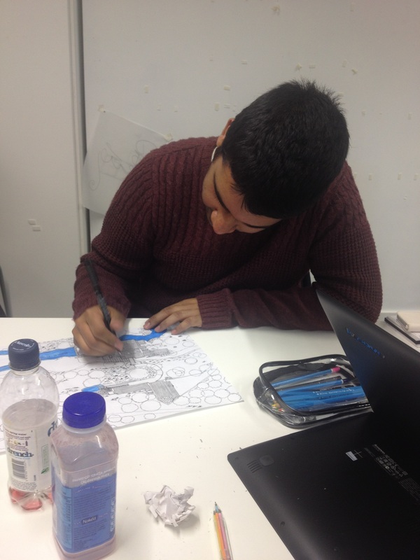
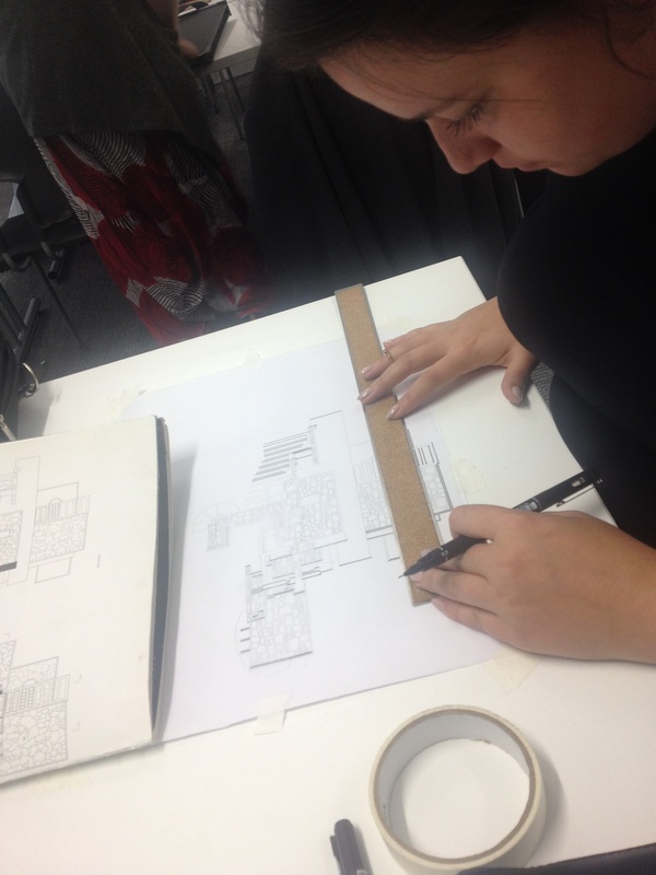
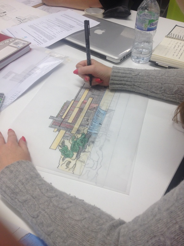
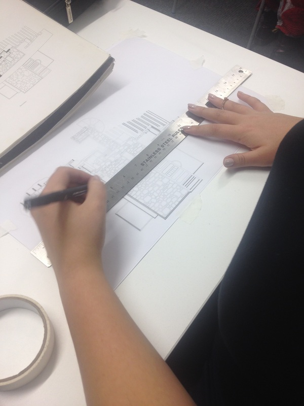
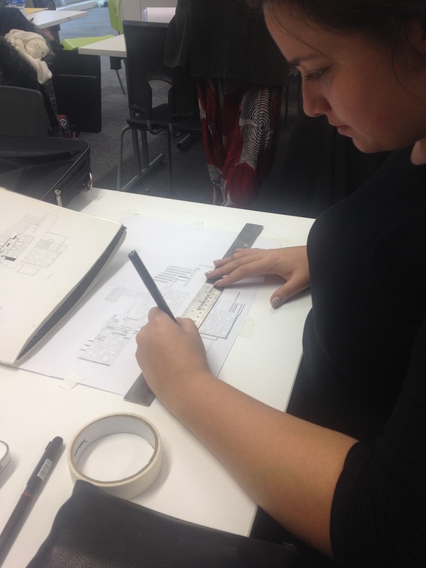
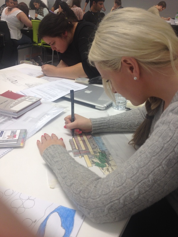
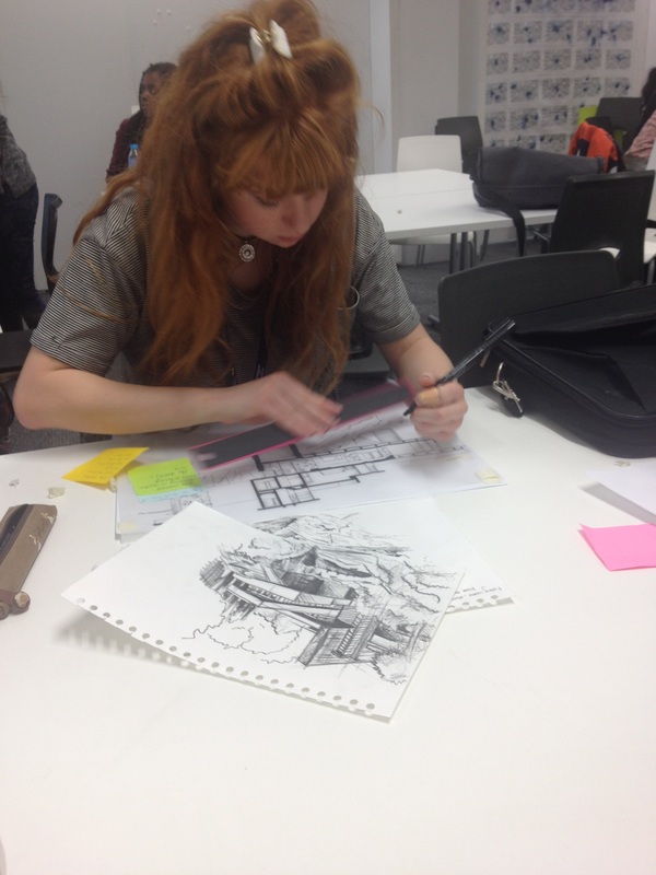
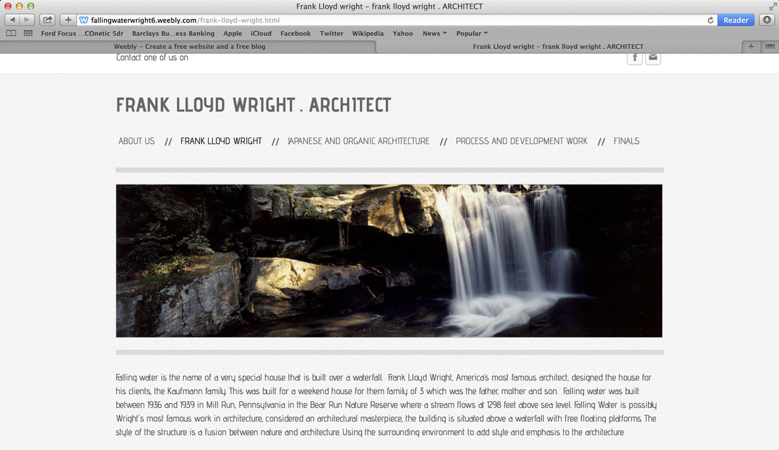
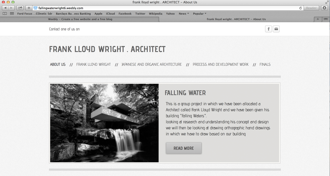
THE START OF OUR DRAWINGS
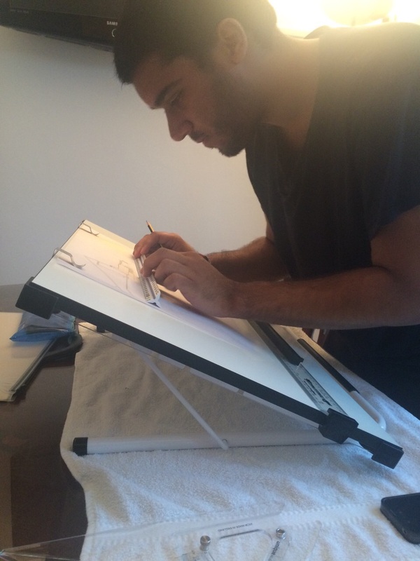
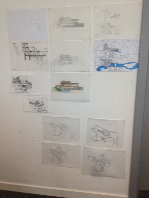
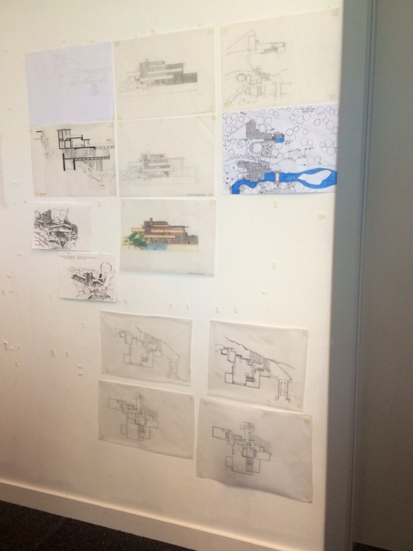
Here are some of our development work in which we are working on. taking pictures to show our process. taking pictures are important because it made us look back and see what went on and parts we went wrong in so its important to record every step we did. I have also attached images of us working on our work to show our progress.
Also on each picture you can see our views about our work which each of us in the team have felt about doing this and how we found it so far.
Also on each picture you can see our views about our work which each of us in the team have felt about doing this and how we found it so far.
OUR OWN DRAWINGS
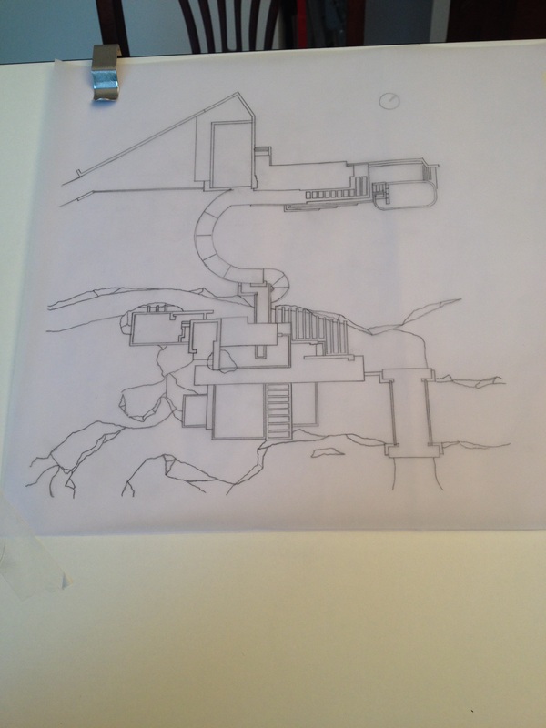
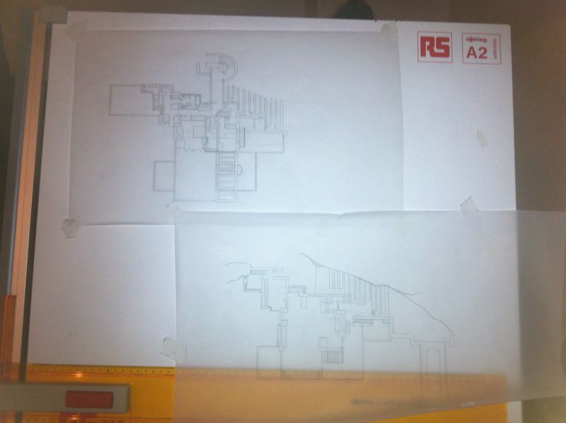
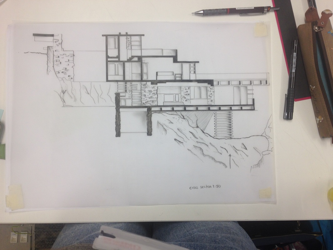
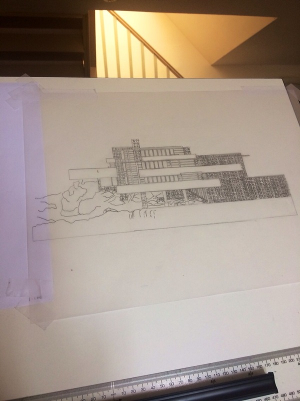
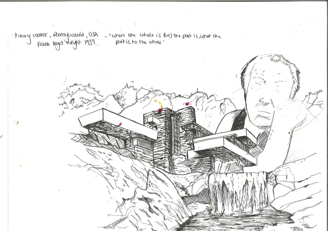
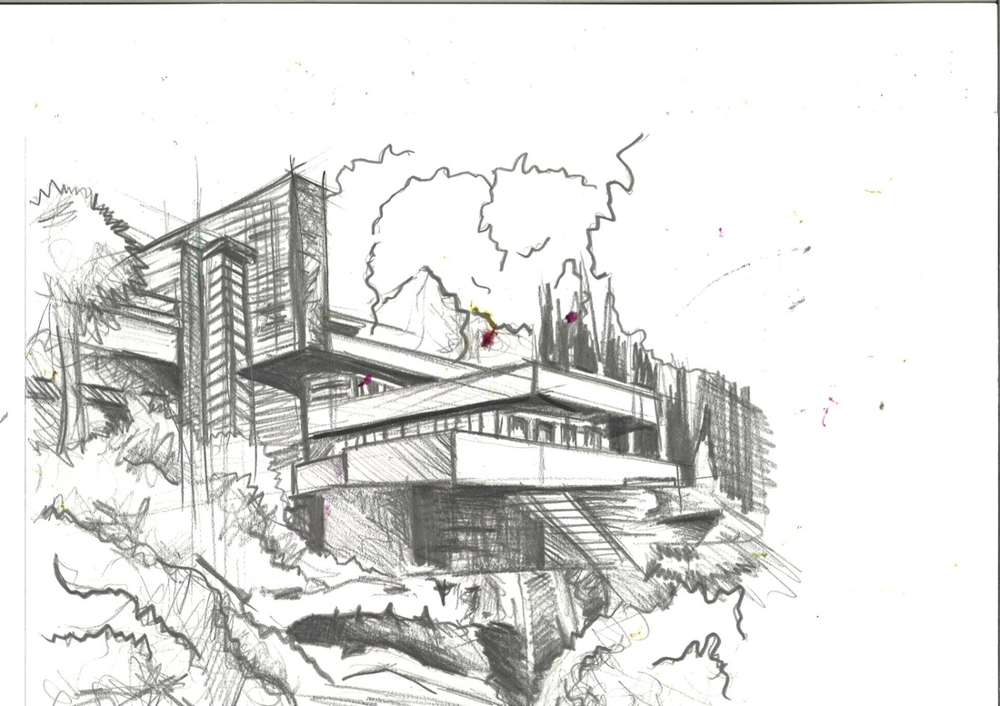
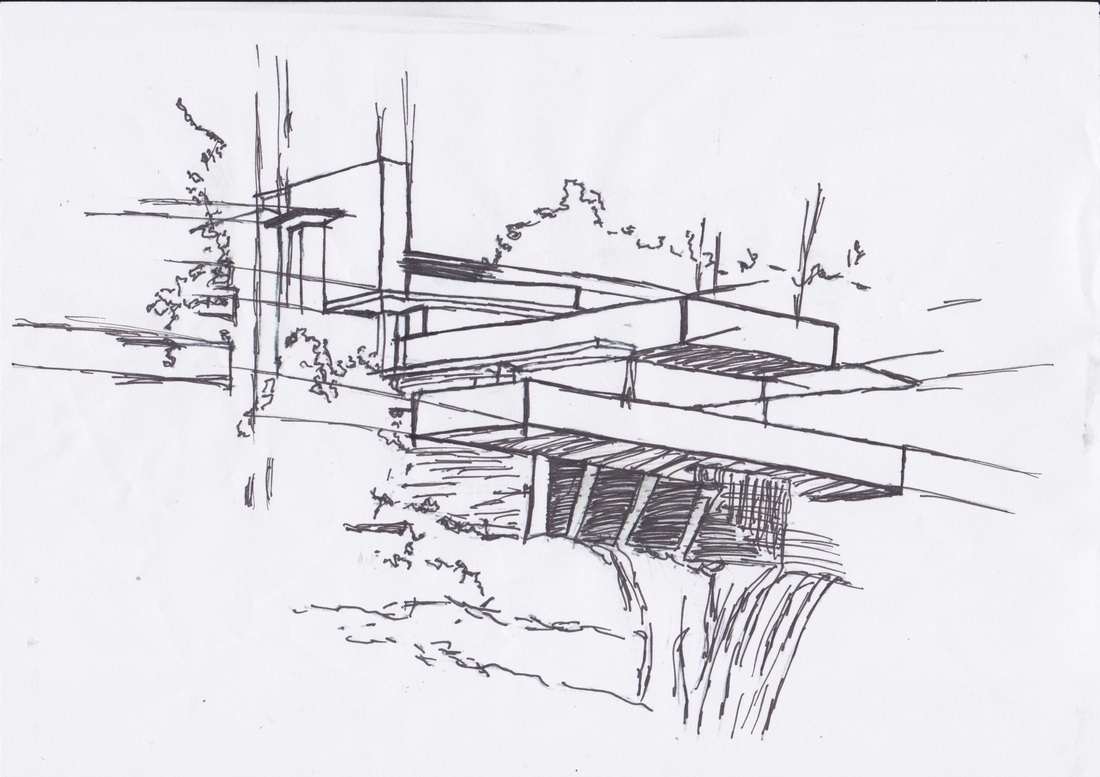
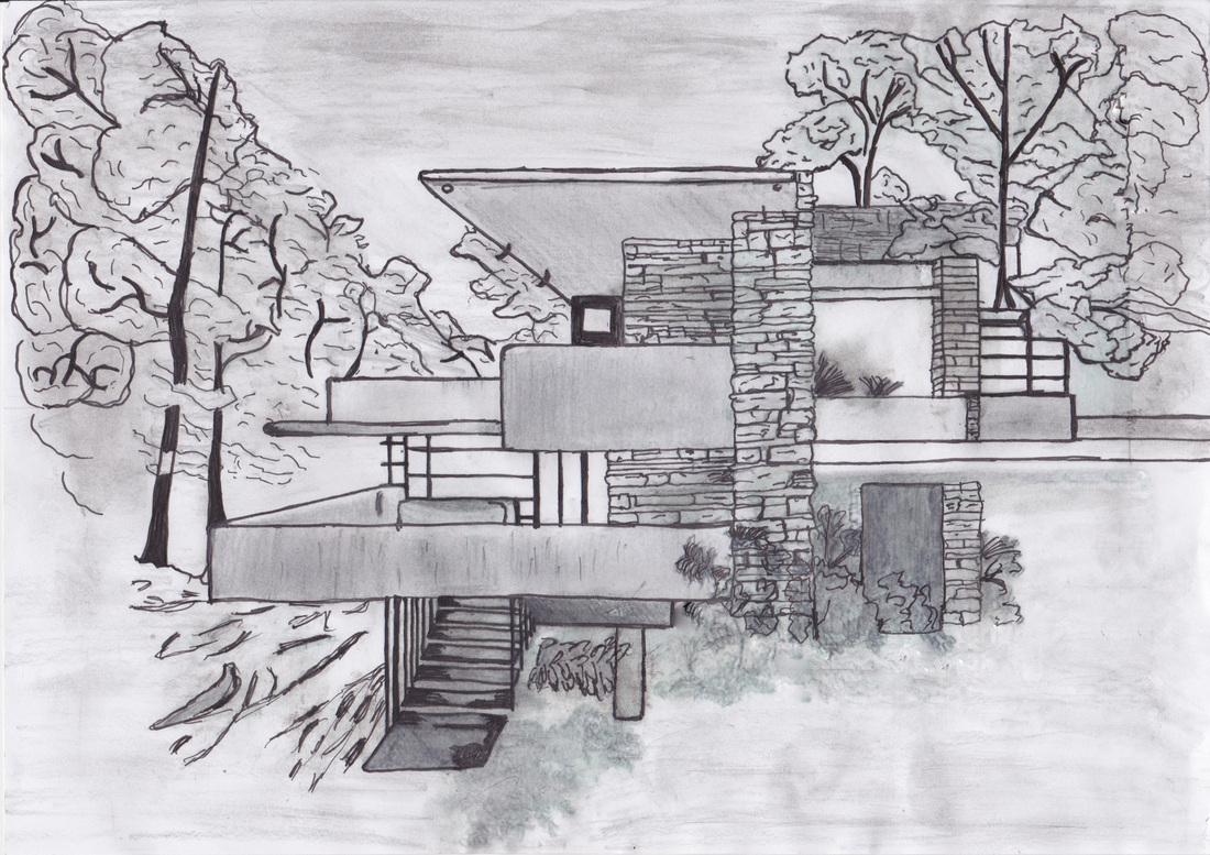
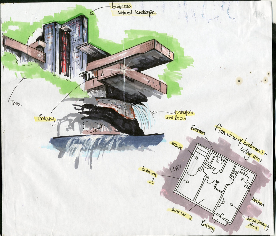
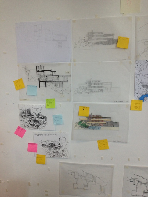
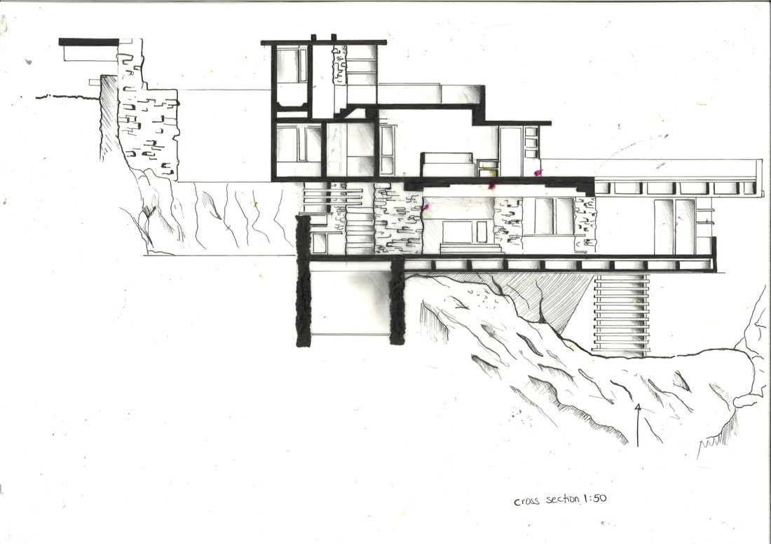
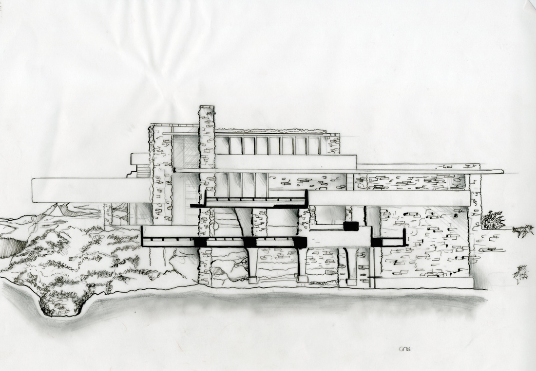
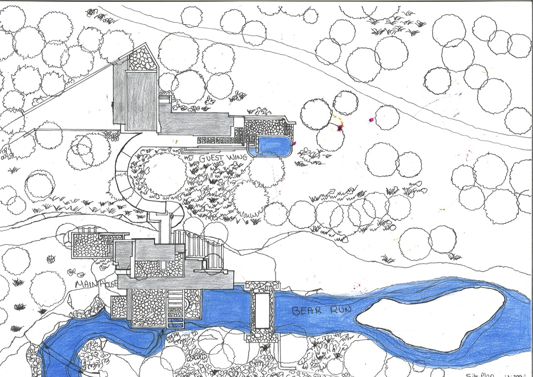
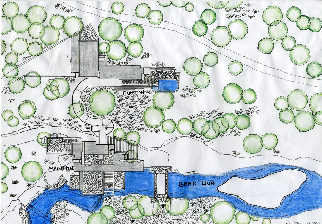
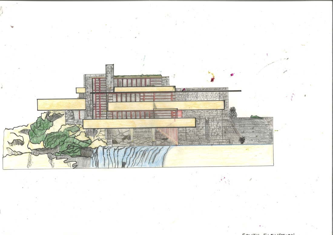
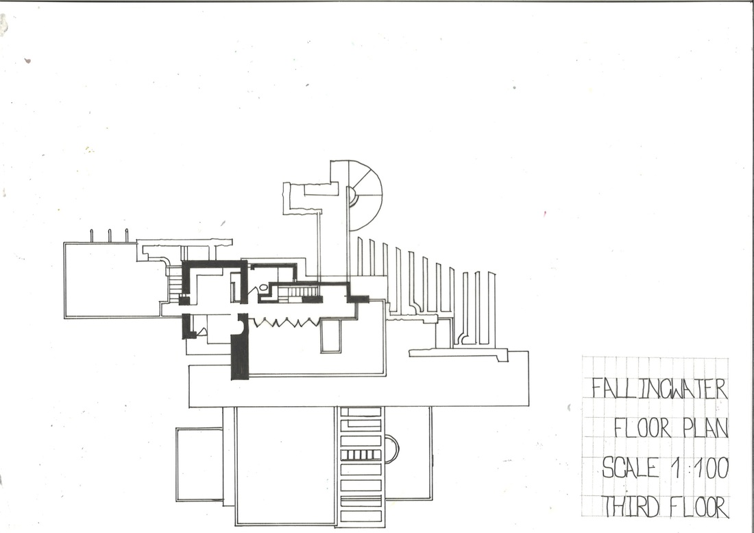
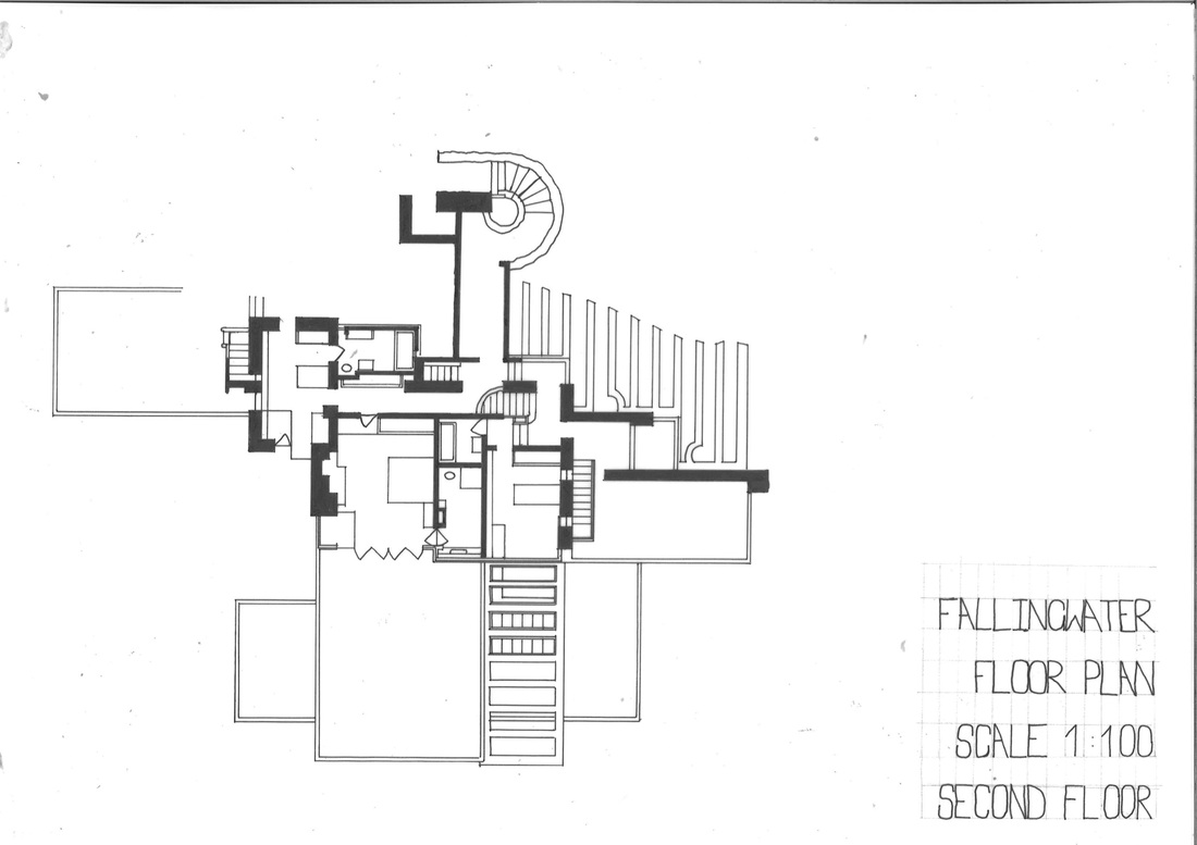
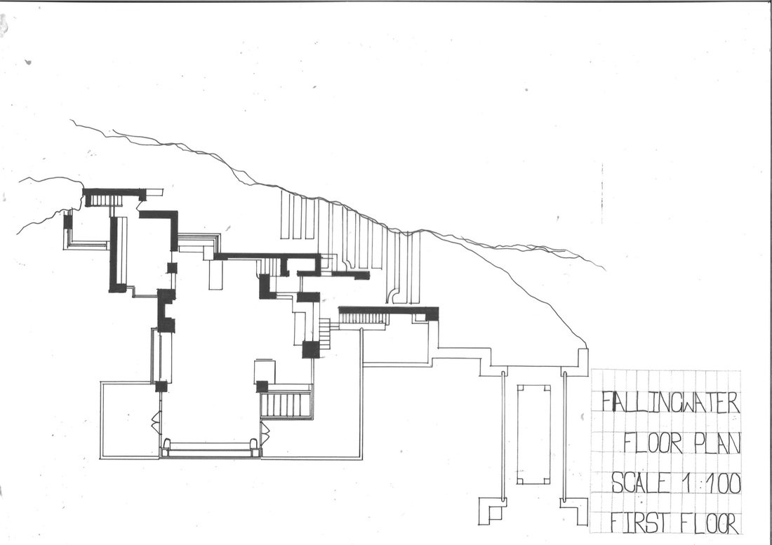
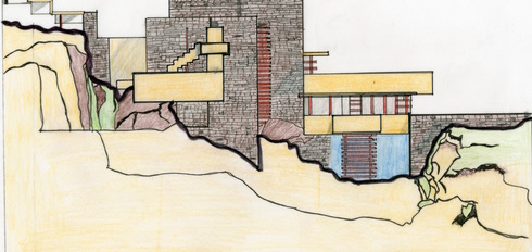
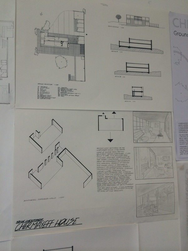
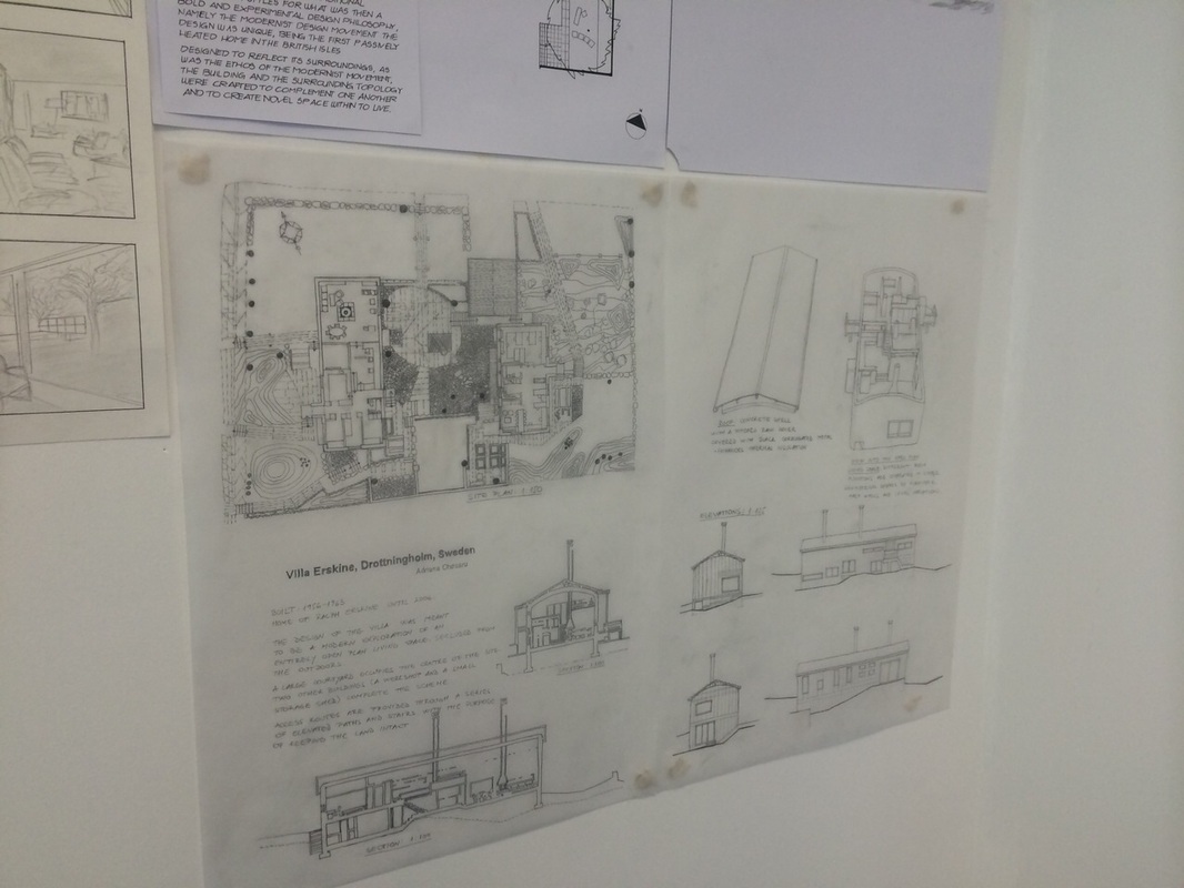
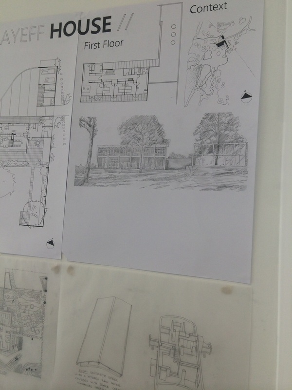
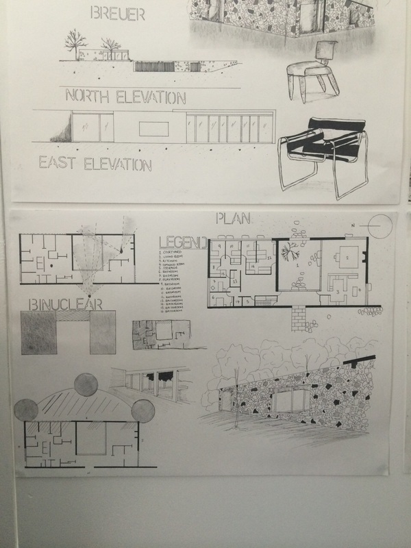
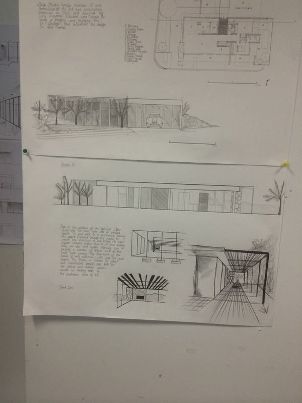
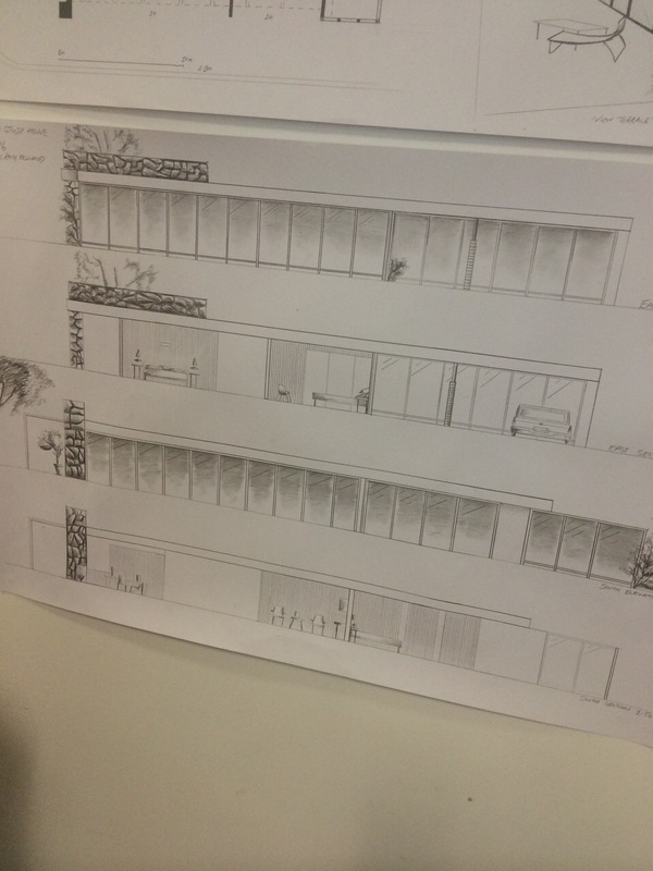
Here we have drawn drawings to help us explore more about the architects work, looking at the building from the outside, drawing sketches made us realise what is where in the house because we all came together as a group to look at these four drawings and it helped us to identify features on the building and helped us produce our plans.
When drawing these we all looked at how we can focus on shading and using pen, because part of our project was to produce the orthogrphic drawings in pen. these drawings show a rough outline of the main bulging rom the outside focusing on the shading and different techniques we used to draw them.
When drawing these we all looked at how we can focus on shading and using pen, because part of our project was to produce the orthogrphic drawings in pen. these drawings show a rough outline of the main bulging rom the outside focusing on the shading and different techniques we used to draw them.
INTERIM FEEDBACK
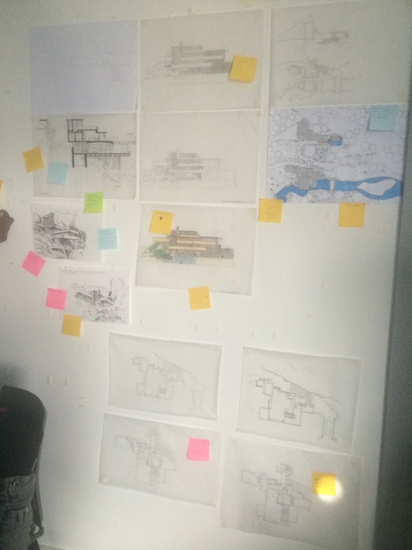
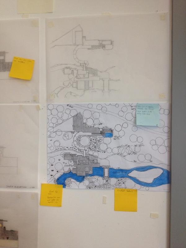
In projects, an interim feedback is important, its often compiled to analyse how the project is proceeding, before its final deadline date. Getting some feedback from tutors and peers of the class we had to pin up our work and observe around the room to look at each others, however also using post notes to write comments on there so other people can see what views we have on there work. We thought this was important because it shows peoples thoughts about our work and how well they can see if we proceeding or not. most of the comments we received were positive, there were a few comments in which we need to discuss as a group. below we have typed up some of the comments which were posted up on our pin up and each one of us writing what we can improve on it will take it further on board.
Jasmin Bhambra-
Hannah Bolland-
Chloe Dent-
Neerij Farmah-
- Do it again using a compass ?
- Outside walls make a wider line to about 0.7/0.8 very neat though
- Very clear floor plans, its noticeable straight away.
Hannah Bolland-
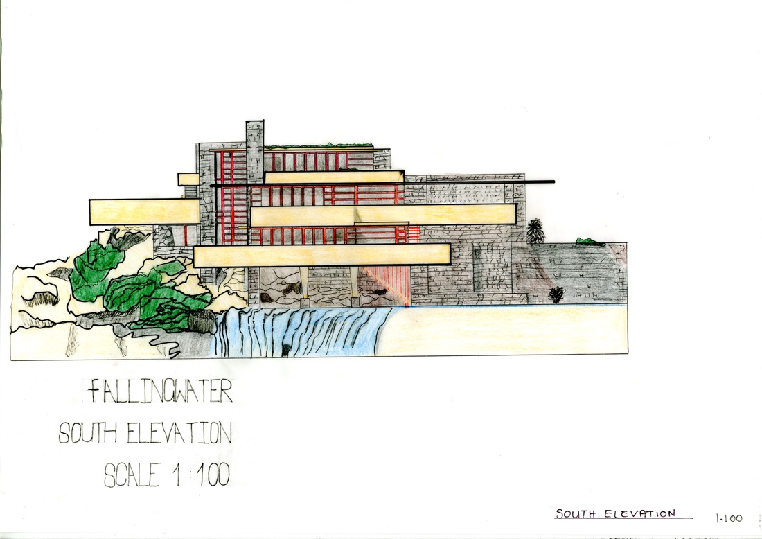
- Like the fact you've done south elevation in colour and as a line drawing
- The bricks can improve maybe less detail on them
- Im in love with this.
Chloe Dent-
- Amazing sketches from both architectural and artistic point of view, however the overall drawing is aesthetically pleasing.
- Detail is spot on
- Like the way you've down shadow and different textures like smudging it.
- Fine line can improve, more accurate, tidy up thick lines
Neerij Farmah-
- Excellent detail on drawing
- Very clear drawing of the site plan, you can notice it straight away, its not overcrowded
- Line work can improve in areas
- Use a less and lighter colour for water too hard for the image.
TUTORS FEEDBACK presentation of blogs
Getting some feedback personally from our tutors for this project, when presenting our blogs to our peers our very first layout of the blog was black and orange which was quiet a interesting layout however with the bright and dark colours together it took away the attention from our work because that was bold on our layout, we needed something simple and with a neutral background, so after that we change out theme straight after because we looked back at it and we could see the same however before we didn't notice this at all. Another thing in which we were told was to make some of the titles on our blog bold and not join in with the text as they need to stand out more.
Overall the feedback we were given, as a group we were pleased with it as, we also got told we presented well and clearly throughout giving the audience a clear understanding of what we were saying and presenting our blog in a chronologically order.
Overall the feedback we were given, as a group we were pleased with it as, we also got told we presented well and clearly throughout giving the audience a clear understanding of what we were saying and presenting our blog in a chronologically order.
So taking some screen shots of our first layout for the blog which was the black and orange, coming back to it take's away attention from then text as the bright orange and black is noticeable straight away. For our layout we wanted something simple and not to crowded on the page so we then found another theme which caught our attention which is a neutral white background which then the black text will stand out for the audience.
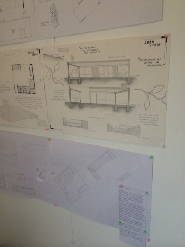
OUR FINAL ORTHOGRAPHIC DRAWINGS
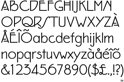
FRANK LLOYD WRIGHT - eaglefeather TYPEFACE
|
Looking at this typeface which is quite funky, its a sans serif typeface which is more readable in our opinion. this typeface is legible so will be noticeable for the audience, if we use this on ur A1 panel, it will be in the title name.. This typeface is quite curvy and wavy which is interesting to see because the typefaces we see nowadays are mostly simple and straight , however this eagle feather font is clean, legible and quiet bold.
|
layout ideas for a1
Below are some photograpghs from some of the 2nd year architecture students work, on friday 17th October they had a pin up, there project was something similar to ours, which they were given a building and to be able to notify the different plans and draw the correct line weights and details. Looking at these gave us some ideas for our layout and how they expect us to layout it out on the A1 panel.
To see some thoughts about there work i have added a caption on the picture, to view this click on the picture.
To see some thoughts about there work i have added a caption on the picture, to view this click on the picture.
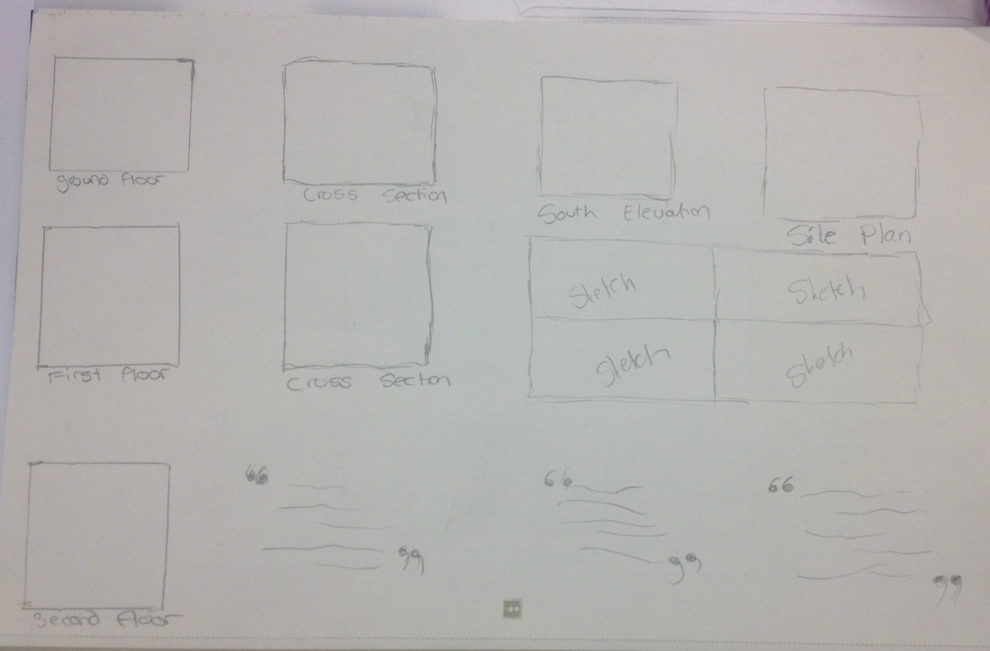
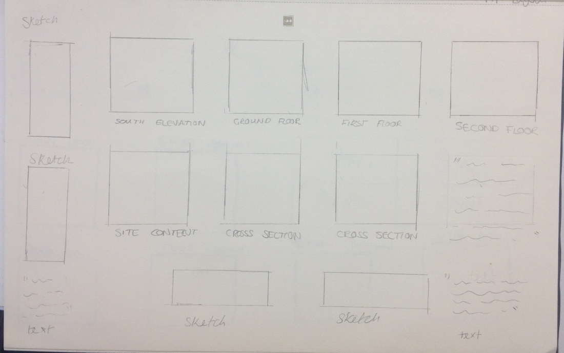
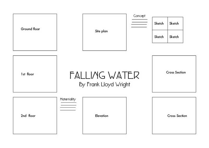
Thumbnail sketches for A1 panel.
So looking back at 2nd years work we have thought about some ideas for our A1 panel. Most importantly thinking about,
- Layout - layout is important because it needs to be consistent and arranged properly so that it doesn't feel messy, it needs to be organised in order so that our peers can understand it.
- Text - text is also important as we need to think about what text we will need and what typefaces are suitable for our project, so as a team we have discussed that we will use frank lloyd wright typeface and the architecture font, which both of these are readable, clear and bold for the audience to read.
- Scale- scale is important when we arrange our final plans on the A1 panel because all of them have to be scaled down to a correct size and all of them have to be the same because it will show accuracy as if we have them all different sizes it won't look professionally.
|
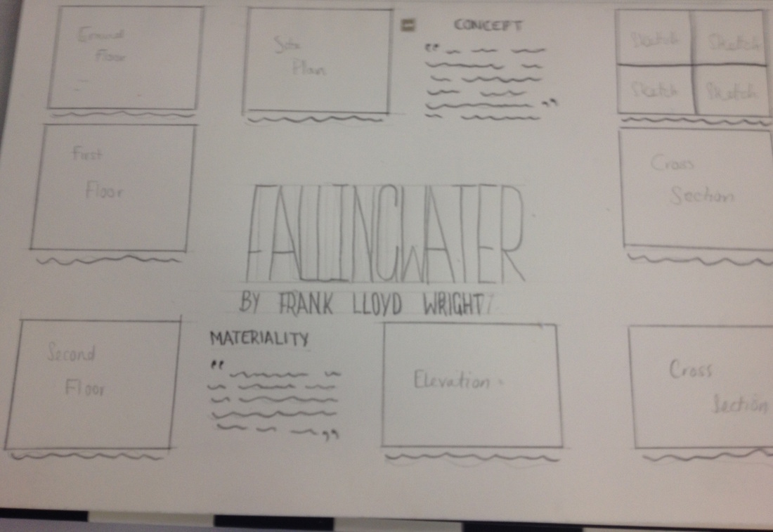
This is our final layout idea, we have chosen this amongst our group. we have a clean and simple layout which won't overcrowd the page, so its all in a grid structure and fills the whole page up.
We have also looked at what text to add within the A1 panel, the main text we would like to add on our panel, is the concept and materiality. |
